
Supervised Machine Learning in Python - Bearing Life
Most of you probably already know what Machine learning is. Simply said, it involves letting a computer and some algorithms use advanced statistics to sort and analyze bulk data to develop connections and patterns that allow for predictions to be made - usually machine failures.
The goal of this article is to outline a process and Python code to solve a translatable Reliability Engineering problem, but with Machine Learning.
So If you want to predict failure there are really only two scenario’s you face.
· I want to predict failures, and I know what a failure looks like (Supervised Machine Learning- This post!)
· I want to predict failures, but I don’t know what a failure looks like (Unsupervised Machine Learning)
The Method:
Extract an interval of operating data for each day until bearing failure is established.
Apply a Short Time Fourier Transform (STFT) to this daily data to establish the failure frequency, and its evolution in amplitude over the coming days
Extract the most important features from the signal used to determine impeding failure by way of a ranking system- monotonicity
Perform Principal Components Analysis to create new variables by reducing/combining feature sets.
Apply various machine learning models and test/train the system and observe model accuracy in predicting bearing failure
So let’s start.
The dataset is collected from a 2MW wind turbine high-speed shaft driven by a 20-tooth pinion gear. A vibration signal of 6 seconds was acquired each day for 50 consecutive days (there are 2 measurements on March 17, which are treated as two days in this example). An inner race fault developed and caused the failure of the bearing across the 50-day period.
This example closely follows this MATLAB tutorial, however I’ve coded this in Python: https://www.mathworks.com/help/predmaint/ug/wind-turbine-high-speed-bearing-prognosis.html
The google collab link with all the code can be found here for those who are curios: HIGH -SPEED- BEARING - PROGNOSIS
Now without further ado, lets get started.
The first block of code below clones the bearing data from a MATLAB Github repository for our manipulation. We then loop through the days and assign variables to the data “Tach” and “Vibration”.
!git clone https://github.com/mathworks/WindTurbineHighSpeedBearingPrognosis-Data
[OUPUT]: Cloning into 'WindTurbineHighSpeedBearingPrognosis-Data'...
remote: Enumerating objects: 83, done.
remote: Total 83 (delta 0), reused 0 (delta 0), pack-reused 83
Unpacking objects: 100% (83/83), done.
import numpy as np
import pandas as pd
import matplotlib.pyplot as plt
import seaborn as sns

from scipy.io import loadmat
from scipy.signal import stft
from scipy.stats import kurtosis, skew

from sklearn.model_selection import train_test_split
from sklearn.linear_model import LogisticRegression
from sklearn.ensemble import RandomForestClassifier
from sklearn.tree import DecisionTreeClassifier
from sklearn.metrics import accuracy_score, classification_report, confusion_matrix

from glob import glob

from mpl_toolkits.mplot3d import Axes3D
  fname = ['data-20130307T015746Z.mat', 'data-20130308T023421Z.mat', 'data-20130309T023343Z.mat',
        'data-20130310T030102Z.mat', 'data-20130311T030024Z.mat', 'data-20130312T061710Z.mat',
        'data-20130313T063404Z.mat', 'data-20130314T065041Z.mat', 'data-20130315T065003Z.mat',
        'data-20130316T065643Z.mat', 'data-20130317T065604Z.mat','data-20130317T184756Z.mat',
        'data-20130318T184715Z.mat','data-20130320T003354Z.mat', 'data-20130321T003314Z.mat',
        'data-20130322T003950Z.mat', 'data-20130323T003911Z.mat', 'data-20130324T004549Z.mat',
        'data-20130325T004512Z.mat', 'data-20130326T014150Z.mat', 'data-20130327T035827Z.mat',
        'data-20130328T095531Z.mat', 'data-20130329T095505Z.mat', 'data-20130330T100142Z.mat',
        'data-20130331T193818Z.mat', 'data-20130401T193739Z.mat', 'data-20130402T194415Z.mat',
        'data-20130403T212942Z.mat', 'data-20130404T212901Z.mat', 'data-20130405T213537Z.mat',
        'data-20130406T221209Z.mat', 'data-20130407T221131Z.mat', 'data-20130408T221809Z.mat',
        'data-20130409T231445Z.mat', 'data-20130410T231407Z.mat', 'data-20130411T231358Z.mat',
        'data-20130412T170231Z.mat', 'data-20130413T170210Z.mat', 'data-20130414T170847Z.mat',
        'data-20130415T225524Z.mat', 'data-20130416T230159Z.mat', 'data-20130417T230120Z.mat',
        'data-20130418T230803Z.mat', 'data-20130419T230747Z.mat', 'data-20130420T151307Z.mat',
        'data-20130421T151231Z.mat', 'data-20130422T151908Z.mat', 'data-20130423T151830Z.mat',
        'data-20130424T215514Z.mat', 'data-20130425T232202Z.mat']
df = pd.DataFrame()
vibration = list()
tach = list()

for f in fname:
    read_mat = loadmat('WindTurbineHighSpeedBearingPrognosis-Data/' + f)
    vibration.append(read_mat['vibration'])
    tach.append(read_mat['tach'])

df['vibration'] = vibration
df['tach'] = tach
This section explores the data in both time domain and frequency domain and seeks inspiration of what features to extract for prognosis purposes.
First visualize the vibration signals in the time domain. In this dataset, there are 50 vibration signals of 6 seconds measured in 50 consecutive days. Now plot the 50 vibration signals one after each other.
fs = int(df.iloc[0,0].shape[0] / 6.0)
t = np.linspace(0.0,6.0,df.iloc[0,0].shape[0])

print('Scan frequency:  Hz'.format(fs))
colors = ['royalblue', 'darkorange', 'gold', 'purple', 'green', 'lightblue', 'firebrick']

plt.subplots(figsize = (12.0,6.0))
for i in range(df.shape[0]):
    c_idx = i % 7
    plt.plot(t + i * 6.0,df.loc[i, 'vibration'], color = colors[c_idx],lw = 0.25)

plt.xlabel('Time (in s): sample = 50 days in total, 6 seconds per day')
plt.ylabel('Acceleration (in g)')
plt.show()

The vibration signals in time domain reveals an increasing trend of the signal impulsiveness. Indicators quantifying the impulsiveness of the signal, such as kurtosis, peak-to-peak value, crest factors etc., are potential prognostic features for this wind turbine bearing dataset.
On the other hand, spectral kurtosis is considered powerful tool for wind turbine prognosis in frequency domain. The frequency domain holds a plethora of information that the time-domain alone cannot complete, therefore its prudent you analyze both.
To visualize the spectral kurtosis changes along time, plot the spectral kurtosis values as a function of frequency and the measurement day.
  f = []
fft = []

wnd = 127

for i in range(df.shape[0]):
    u,v,w = stft(df.loc[i, 'vibration'].squeeze(),fs,nperseg = wnd,noverlap = int(0.8 * wnd),nfft = int(2.0 * wnd))
    f.append(u)
    fft.append(kurtosis(np.abs(w),fisher = False,axis = 1))

f = np.asarray(f)
fft = np.asarray(fft)

fftn = (fft - fft.min()) / (fft.max() - fft.min())

fftn = np.asarray(fftn)
n = np.ones_like(f[0])

  fig = plt.figure(figsize = (10.0,10.0))
ax = plt.axes(projection = '3d')
ax.view_init(30,225)
for i in range(f.shape[0]):
    ax.plot(f[i] / 1.0e3,i * n,fftn[i],color = 'black',linewidth = 0.50)

ax.set_xlabel('Frequency (Hz)')
ax.set_ylabel('Time (day)')
ax.set_zlabel('Spectral Kurtosis')
plt.show()

It is observed that the spectral kurtosis value around 10 kHz gradually increases as the machine condition degrades. Statistical features of the spectral kurtosis, such as mean, standard deviation etc., will be potential indicators of the bearing degradation.
Based on the analysis in the previous section, a collection of statistical features derived from the time-domain signal and spectral kurtosis are going to be extracted. You can do these with Scipy packages, but I thought I’d spell out the Math in Python below so you can see what these features entail.
for index, val in df.iterrows():

    df.loc[index, 'mean'] = val['vibration'].mean()
    df.loc[index, 'std'] = val['vibration'].std()
    df.loc[index, 'skew'] = skew(val['vibration'])
    df.loc[index, 'kurtosis'] = kurtosis(val['vibration'].squeeze(), fisher=False)
    df.loc[index, 'peak2peak'] = val['vibration'].ptp()
    df.loc[index, 'rms'] = np.sqrt(np.mean(val['vibration']**2))
    df.loc[index, 'crestFactor'] = max(val['vibration'])/df.loc[index, 'rms']
    df.loc[index, 'shapeFactor'] = df.loc[index, 'rms']/np.mean(np.abs(val['vibration']));
    df.loc[index, 'impulseFactor'] = np.max(val['vibration'])/np.mean(np.abs(val['vibration']))
    df.loc[index, 'marginFactor'] = np.max(val['vibration'])/np.mean(np.abs(val['vibration']))**2
    df.loc[index, 'energy'] = np.sum(val['vibration']**2)

    df.loc[index, 'SKMean'] = fftn[index].mean()
    df.loc[index, 'SKStd'] = fftn[index].std()
    df.loc[index, 'SKSkewness'] = skew(fftn[index])
    df.loc[index, 'SKKurtosis'] = kurtosis(fftn[index], fisher=False)

df.drop(['vibration', 'tach'], axis=1, inplace=True)
df.head(10)

Feature Postprocessing
Extracted features are usually associated with noise. The noise with opposite trend can sometimes be harmful to the RUL prediction. In addition, one of the feature performance metrics, monotonicity, to be introduced next is not robust to noise. Therefore, a causal moving mean filter with a lag window of 5 steps is applied to the extracted features, where "causal" means no future value is used in the moving mean filtering.
Here is an example showing the feature before and after smoothing
df_smooth = pd.DataFrame()

for col in df.columns:
    df_smooth[col] = df[col].rolling(5).mean()

plt.figure(figsize=(10,8))
x = np.arange(50)
plt.plot(x, df['SKMean'], label='Before smoothing')
plt.plot(x, df_smooth['SKMean'], label='After smoothing')
plt.xlabel('Time')
plt.ylabel('Feature Value')
plt.title('SKMean')
plt.legend(loc='best')

Training Data
In practice, the data of the whole life cycle is not available when developing the prognostic algorithm, but it is reasonable to assume that some data in the early stage of the life cycle has been collected. Hence data collected in the first 20 days (40% of the life cycle) is treated as training data.
Dimension Reduction and Feature Fusion
Principal Component Analysis (PCA) is used for dimension reduction and feature fusion in this example.
Principal Component Analysis (PCA) is a statistical technique used in machine learning and data analysis to reduce the dimensionality of a dataset while preserving its key features and patterns. It works by transforming the original set of variables into a smaller set of linearly uncorrelated variables, called principal components. These principal components are orthogonal (perpendicular) to each other and capture the maximum amount of variance in the data.
PCA is particularly useful in scenarios where there are many correlated variables or when dealing with high-dimensional datasets. The main benefits of PCA include:
Noise reduction: By focusing on the most important features in the data, PCA can help filter out noise and improve the performance of machine learning algorithms.
Visualization: Reducing the dimensionality of a dataset can make it easier to visualize and understand the relationships between variables.
Computational efficiency: PCA can reduce the computational cost of training machine learning models by reducing the number of input features.
Before performing PCA, it is a good practice to normalize the features into the same scale. Note that PCA coefficients and the mean and standard deviation used in normalization are obtained from training data, and applied to the entire dataset.
breakpoint = fname.index("data-20130327T035827Z.mat")
traindata = df_smooth.iloc[:breakpoint, :]

traindata_selected = traindata.loc[:, ['mean', 'kurtosis', 'shapeFactor', 'marginFactor', 'SKStd']].dropna()
feature_selected = df.loc[:, ['mean', 'kurtosis', 'shapeFactor', 'marginFactor', 'SKStd']].dropna()

  def PCA(A):
    """ performs principal components analysis
     (PCA) on the n-by-p data matrix A
     Rows of A correspond to observations, columns to variables.

    Returns :
    coeff :
    is a p-by-p matrix, each column containing coefficients
    for one principal component.
    score :
    the principal component scores; that is, the representation
    of A in the principal component space. Rows of SCORE
    correspond to observations, columns to components.
    latent :
    a vector containing the eigenvalues
    of the covariance matrix of A.
    """
    # computing eigenvalues and eigenvectors of covariance matrix
    M = (A-np.mean(A.T,axis=1)).T # subtract the mean (along columns)

    [latent,coeff] = np.linalg.eig(np.cov(M)) # attention:not always sorted
    score = np.dot(coeff.T,M) # projection of the data in the new space

    return coeff,score,latent

  traindata_selected_values = traindata_selected.iloc[:, :].values

mean_train = traindata_selected_values.mean()
std_train = traindata_selected_values.std()
traindata_normalized = (traindata_selected_values - mean_train) / std_train

coeff, score, latent = PCA(traindata_normalized)

feature_selected_check = df_smooth.loc[:, ['mean', 'kurtosis', 'shapeFactor', 'marginFactor', 'SKStd']].dropna()

feature_selected_values = feature_selected_check.iloc[:, :].values
PCA1 = ((feature_selected_values - mean_train) / std_train) @ coeff[:, 1]
PCA2 = ((feature_selected_values - mean_train) / std_train) @ coeff[:, 2]

plt.figure(figsize=(12,10))
cm = plt.cm.get_cmap('RdYlBu')
sc = plt.scatter(PCA1, PCA2, c=PCA2, vmin=0.90, vmax=1.06, cmap=cm, s=35)
plt.colorbar(sc)

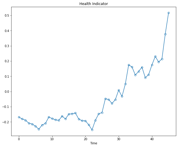
The plot indicates that the first principal component is increasing as the machine approaches to failure. Therefore, the first principal component is a promising fused health indicator as it has a trendable feature. Remember, you cant detect failures without some sort of trendability.
Lets plot it below by itself:
health_indicator = PCA1

plt.figure(figsize=(10, 8))
plt.plot(range(len(health_indicator)), health_indicator, marker='o', mfc='none')
plt.title("Health Indicator")
plt.xlabel("Time")
Training a random forest classifier
A Random Forest classifier is an ensemble learning method in machine learning that is used for both classification and regression tasks. It works by constructing multiple decision trees during the training phase and aggregating their predictions to make a final decision. The main idea behind Random Forest is to improve the overall performance by combining the outputs of multiple weak models (decision trees) to produce a more accurate and robust prediction.
Random Forest classifiers are used for several reasons:
Improved Accuracy: By aggregating the outputs of multiple decision trees, a Random Forest classifier typically achieves better accuracy than a single decision tree. This is due to the reduction of overfitting, as each individual tree is trained on a random subset of the data.
Robustness: Random Forest is less sensitive to noise and outliers in the data because it relies on the majority vote or average of multiple trees, rather than the output of a single tree.
Handling Missing Data: Random Forest can handle missing data better than many other algorithms. During the construction of decision trees, if a feature value is missing for a particular data point, the algorithm can still make a decision based on the remaining features.
Feature Importance: Random Forest can provide an estimate of the importance of each feature in the dataset. This can help in feature selection and understanding the underlying structure of the data.
Parallelization: The process of training multiple decision trees can be parallelized easily, which makes Random Forest well-suited for large datasets and high-performance computing environments.
However, it's important to note that Random Forest classifiers can be slower to train and predict compared to some other algorithms, especially when dealing with a large number of trees. Additionally, the model can become quite complex, making it harder to interpret and explain.
The Kurtosis is used as input for the classifier (variable X) and the labels associated to the two RUL classes are defined throughout the variable y — Medium-life Expectancy Class (y = 0) for the first 35 samples, and Short-life Expectancy Class (y = 1) for the last 15 samples.
Below we are splitting our data into Test and Train sets for using the Random Forest Classifier:
X = fftn
y = np.zeros(X.shape[0],dtype = int)
y[-15:] = 1

X_train, X_test, y_train, y_test = train_test_split(X, y, test_size=0.2, random_state=42)
X_train, X_test, y_train, y_test = train_test_split(X, y, test_size=0.2, random_state=42)

def classification_reports(y_true, y_pred):
    print(f"The accuracy is {accuracy_score(y_true, y_pred)}")
    print()
    print("The Classification Report is:")
    print()
    print(classification_report(y_true, y_pred))

# Classification Report for testing data
y_test_pred = model.predict(X_test)
classification_reports(y_test, y_test_pred)

We can see that the random forest classifier predicts the bearing failure using the remaining test data with about 90% accuracy.
The google collab file with the code shows some more examples of different machine learning algorithms being applied and their respective confusion matrices. In there I also cover a quick extraction of the most important features from the model by Random Forest Classifier.
This example is basic, but has a solid framework to build on and gives a great intro to how you may start a machine learning application in the realm of Reliability Engineering.