
How to create Jack-Knife Diagrams for Reliability Engineering
Jack-Knife Diagrams, also known as Log-Scatter Plots, serve as an invaluable visual tool in the realm of Reliability Engineering for prioritizing areas of downtime that require improvement. While many engineers rely on Pareto Charts, we will explore the shortcomings of this approach and how the Jack-Knife Diagram overcomes them.
Now, let's delve into the distinction between the two methods.
Pareto Charts:
A Pareto Chart displays cumulative downtime in descending order. It is based on the principle that roughly 80% of equipment downtime is attributed to 20% of failures. This principle finds parallels in other domains, such as how 80% of tax revenue stems from 20% of the population or how we tend to wear only 20% of our wardrobe 80% of the time.

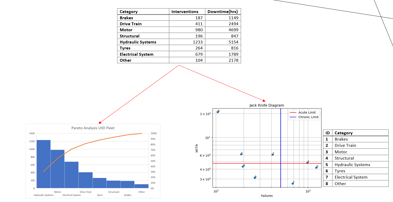
A Pareto chart of an LHD Fleet
Maintenance costs and downtime result from two key factors: the number of failures occurring within a specific timeframe and the average repair costs, also known as MTTR (Mean Time to Repair). When relying solely on a Pareto chart based on downtime or cost, it becomes challenging to determine the dominant factor(s) contributing to downtime or cost for specific failure codes.
Pareto charts have limitations in identifying individual events with significant associated downtime or frequently occurring failures that may cause frequent operational disruptions but consume relatively little downtime. For instance, a downtime event occurring 100 times for 5 minutes each may appear insignificant compared to a single major event lasting, let's say, 1000 minutes. However, the operational disturbance cost of these frequent events can be difficult to quantify yet represents an underlying chronic problem that could be a valuable opportunity for resolution.
Furthermore, it is important to consider that the same failure mode may be present in multiple lower Pareto histograms. Failing to identify or underestimating the relative importance of these common cause failure modes can hinder accurate analysis and decision-making.
By acknowledging these factors, we can adopt a more comprehensive approach to effectively address and mitigate the impact of failures on maintenance costs, downtime, and overall operational efficiency.
Jack-Knife Diagram:
The Jack-Knife Diagram consists of two axes: MTTR (Mean-Time-to-Repair) and N (number of events). It divides downtime events into four distinct quadrants: Acute & Chronic, Acute, Chronic, and the ideal Zone.
Downtime events falling into the Acute & Chronic quadrant demand top priority as they occur frequently and result in significant downtime. The objective is to shift these events from the upper right quadrant to the lower left, known as the "Ideal Zone."
In contrast to the Pareto chart, the Jack-Knife Diagram provides different insights based on the same dataset. For instance, the diagram identifies motor events in LHDs as the top priority, whereas the Pareto chart ranks them as the second priority. This discrepancy arises because the Pareto chart fails to recognize the chronic nature of these motor events.

A Jack-Knife Diagram of the same LHD Fleet (Note the four zones)
It is important to note that the Jack-Knife Diagram is a continuous improvement tool. That is, the Acute and Chronic Limits aren’t fixed, and move as the data is updated, therefore you will always have an area to improve on. Should you wish to see the evolution of your reliability improvement strategies, you can fix these limits in place- but we’ll cover this a bit later in the article.
Jack-Knife Diagram Limits:
Maintenance Downtime can be represented by the equation:
Downtime = n × MTTR
A disadvantage of this is that curves of constant downtime are hyperbolae and are difficult to plot. The solution is to convert these to Logarithmic plots. A JKD starts off by plotting downtime events or areas on a log-log (base 10) plot of Number of failure vs MTTR, or more specifically expressed from the previous expression as:

The Limit characteristics of these charts are determined by the following formulae:
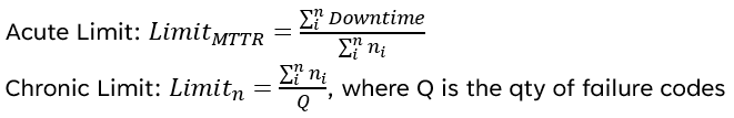
The availability limit of the current system is the product of the Acute and Chronic limits and gives the average downtime per fault code. The availability limit of the system should thus go straight through the intersection of the chronic and acute limits. It technically isn’t the “availability” but the avg downtime per fault code, so inversely related.
Creating a Jack-Knife Diagram in Excel:
For this example we will be using the data in the table below, which is from a fleet of 11 Underground LHD’s (or Load-Haul-Dump Loaders)

We start off by Calculating the Acute, Chronic and Availability Limits as seen in the sequential steps below. We also create the plotting matrix to create the graph in Excel. Note that for the availability limit, the y-values are simply the “X” divided by the Availability Limit.

Calculating Availability Limits:
It's important to keep in mind that the availability limit of the current system is determined by the Acute and Chronic limits, representing the average downtime per fault code.
To calculate the Target Availability, a reverse approach is required. Assuming a total operating hours of 6000 hours per year for a fleet of 11 LHDs, the available time amounts to 66,000 hours. The current availability stands at 71%, indicating room for improvement.
Let's consider a desired availability of 95%. To determine the allowable downtime for the fleet per year, we subtract 95% from 100% and multiply it by 66,000 hours, resulting in 3300 hours. Next, we divide this figure by the number of fault categories (in this case, 8), giving us a target availability of 412.5 hours per fault category.
It's worth noting that the Jack-Knife Diagram Limits are continuous and will adjust accordingly when the input event data changes. To evaluate the effectiveness of improvement strategies, it's essential to fix the limits in place. This can be easily achieved by hard-coding the limits in the plotting table. By doing so, you can monitor whether your downtime events are shifting towards the lower-left quadrant, indicating progress.
By understanding these calculations and utilizing the Jack-Knife Diagram effectively, you can make informed decisions to optimize availability and minimize downtime in your system.
Pareto vs Jack-Knife Results:

We can see from the above and below that the JKD and Pareto both show different priorities, however the JKD shows the motor as the number 1 priority because of its combined chronic and acute effects, while the Pareto only sees the downtime and ranks it as number 2. Frequent operational disturbances cause a tremendous amount of undocumented cost that the data doesn’t show.
What to do after your Jack-Knife Diagram:
Once you’ve identified your priority lists, you must then conduct RCA’s into the causes of the downtime events
Depending on the root cause, you may need to engineer-out issues by redesign, adjust maintenance tactics, improve operating parameters, and train operators to take care of the equipment.
With JKD’s you can visually see the reaction assets have to strategies when you “lock” the chronic and acute limits, which makes it an excellent visual tool to ensure your adjustments are pushing performance in the right direction.
The fully worked example in Excel can be downloaded below using the form, or you can use the interactive, free web tool here: jkd.pardusconsulting.com

Reliability Engineering Essentials Bundle
Four practical guides plus ready-to-use Excel templates to master the core analytical tools used by reliability engineers .
This bundle includes step-by-step guides with real-world case studies covering:
Weibull Analysis — Learn to model equipment failure patterns, estimate component lifespans, and calculate reliability metrics using field data from hydraulic cylinders. Includes Excel template.
Conditional Probability of Failure — Quantify the risk of running equipment beyond scheduled maintenance intervals and make economically sound decisions using haul truck tyre data.
Jack-Knife Diagrams — Prioritise downtime events more effectively than Pareto charts by identifying chronic vs. acute reliability problems across your fleet. Includes Excel template.
Spares Management — Calculate optimal inventory levels for critical components, balancing holding costs against stock-out risk using Poisson distribution methods. Includes Excel template.
Each guide includes the mathematical foundations and worked examples, while the accompanying Excel templates let you apply these methods immediately to your own equipment data — no programming required.